
Building Little Together
Cozy by choice: a motion and controls update
How Little Together’s current concept site handles animation preferences, keyboard controls, and the limits of calling an experience cozy.
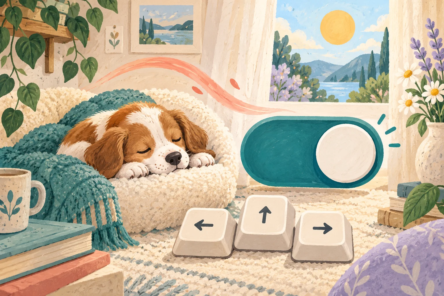
“Cozy” should describe choices, not promise a feeling
Little Together is being designed in the broad neighborhood of cozy games: a small virtual pet world, familiar care actions, a home, a garden, and memories a person chooses to save. But “cozy” is not a measurable outcome that every player will experience in the same way.
For this project, the word is more useful as a design question. Can people understand what is happening? Can they slow down or stop nonessential motion? Can they leave without losing the thread of the visit? Can they choose a short care action instead of being pushed through a stream of tasks? This update explains what is visible on the current concept website and what remains unfinished in the game.
What is implemented on the concept site today
The current Little Together website detects the device’s reduced-motion preference. When that preference requests less motion, the site removes its nonessential transitions and animations. The footer also includes a separate Animations on or off control, and the choice is kept in local browser storage for that browser.
The interactive world preview uses buttons with selected-state information. Its Home, Garden, and Memories tabs support Left Arrow, Right Arrow, Home, and End keys, and visible focus outlines help show which link or button is active. These are implemented website behaviors, not evidence that every future game screen is complete.
Why a separate animation control matters
An operating-system preference is a strong starting signal, but a person may want a different setting for one experience. The explicit footer control makes the choice visible inside the site. It also gives someone a way to turn motion off without first finding a device-level accessibility menu.
The W3C guidance for animation from interactions says nonessential motion triggered by interaction should be disableable. MDN documents the prefers-reduced-motion media feature as a way for sites to detect when a person has asked their device to minimize nonessential motion. Our current approach uses both signals: honor the device and keep a local site control.
What turns off and what stays understandable
When motion is off, the illustrated pet does not need to wag, bounce, or reveal content through movement for the page to make sense. Headings, descriptions, buttons, and selected states remain. The goal is to preserve the information while removing decoration that depends on animation.
That separation is important for future pet interactions. A wagging tail may add character, but it should not be the only indication that an action succeeded. Care state will need a readable label, icon, or other persistent response as well. That game behavior is a design requirement under consideration, not a completed production feature.
Avoiding an endless moving screen
The concept site uses short decorative reactions rather than a permanent wall of motion. The small footer pet responds when a person chooses to interact, and the page offers one place to turn animation off. The site does not use an automatically advancing carousel for the product story.
W3C guidance says automatically moving, blinking, or scrolling information that starts on its own, lasts more than five seconds, and appears beside other content needs a way to pause, stop, or hide it unless the movement is essential. That rule is a useful floor for a pet world, where several animated objects could otherwise compete for attention.
Keyboard behavior is part of the evidence
A mouse or touch gesture should not be the only route through a concept. The world tabs can be reached and changed with a keyboard, while the current selection is exposed through the tab pattern. The main page also provides a skip-to-content link for keyboard users.
This does not amount to a complete accessibility audit. We have not published results from assistive-technology testing, user research, gamepad testing, or a formal conformance review. The implemented controls are evidence of direction, not a certification.
How these choices could shape the virtual pet loop
The prototype currently explores local feeding, play, grooming, rest, garden movement, and titled memories. A lower-motion version of that loop should preserve every decision: a person still needs to know which care action is available, what changed, how to move between home and garden, and whether a memory was saved.
A practical design test is to turn animation off and attempt the whole visit. If the pet’s state becomes ambiguous, if a button loses its response, or if a transition was carrying essential information, the interface needs another cue. Reduced motion should not mean reduced understanding.
What we are not claiming
We are not claiming that motion settings make a game therapeutic, that cozy games produce a particular wellbeing result, or that the current website proves the eventual app is accessible. Individual preferences and access needs differ, and the released product does not exist yet.
We are also not announcing audio behavior, reminder schedules, final controls, supported devices, price, or a launch date. Optional sound is part of the design direction, but its production settings and testing have not been published.
The next evidence to look for
Before public app access, useful evidence would include a complete keyboard path where applicable, visible focus and selected states, text that can be resized without losing actions, state changes that do not rely on color or motion alone, and an animation setting that covers the whole experience consistently.
For shared care, those interface choices must sit alongside production accounts, invitations, access removal, and synchronized state. The current prototype still saves locally and simulates partner perspectives. Remote care, accounts, and invitations remain planned.
Where Little Together stands
Today, Little Together has a public concept site with working motion preferences and keyboard-aware interactive elements, plus a local pet-world prototype exploring care, home, garden, and intentional memories. The site’s partner views remain simulations.
App, download, and play links are coming soon. Until real access exists, build updates will continue to separate implemented behavior, prototype exploration, and future plans.
A little more to explore
 Building Little Together
Building Little Together · 13 Oct 2026
Build update: local care before shared care
What Little Together’s virtual pet prototype can do locally, what simulated sharing means, and what must exist before remote care is real.
A little read ↗ Together time
Together time · 18 Oct 2026
Paint one shared scene on two canvases
A practical 75-minute painting date using one shared palette, two adjoining pictures, and a no-critique reveal.
A little read ↗